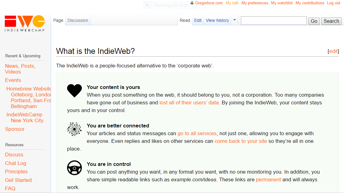
I am tinkering with the user-customized CSS for the indiewebcamp.com wiki and thought I would share.
My custom CSS is here. You can edit yours by going to “My Preferences”, clicking “Appearance”, then clicking “Custom CSS” beside the Vector skin.
html { font-size: 62.5%; }
body { font-size: 1.7rem; }
#bodyContent { font-size: inherit; }
This sets the base font-size to 10px, which serves as a nice base for easily calculating and setting the font-size elsewhere. 1.7rem * 10px = 17px. I am on an HD display and prefer text being a bit larger.
p { line-height: 1.6; }
This sets a reasonable amount of space between lines.
input, textarea { font: inherit; font-size: 1.8rem; font-family: monospace, monospace; }
input[type="submit"] { font-family: Arial, sans-serif; font-size: 1.6rem; }
I prefer the text in the wiki edit textarea to be a bit larger, too, and in a monospace font.
a,
a:visited,
div#content a.external,
div#mw-panel div.portal div.body ul li a,
div#mw-panel div.portal div.body ul li a:visited { color: #FF5C01; }

a.new, #p-personal a.new { color: #FFB100; }

.previewnote { color: #ff0000; }
This sets (most) link colors to use the latest indieweb branding colors. Links to pages that don't exist yet are the yellow color in the logo. Otherwise links are the orange color. These colors might be too intense for you—I am not entirely sure I will keep them like this myself, but I definitely prefer it over the default blue-and-purple link colors.
div#mw-panel div.portal div.body ul li { font-size: inherit; }
This sets the font-size of the left sidebar links. This still needs some tinkering; some of the links are too wide for the default sidebar width.
Before (click for full-size)
After (click for full-size)


