Added some spoopy to my site with the posting activity bar on the homepage:


Canonical Links in Google Products
Short version: Adding the rel=canonical URL in your web pages is important for more than just search results. It can also impact link previews in other Google products like Docs.
I recently ran into a weird edge case with link previews in Google Docs. A work client has an online directory and each profile has a unique permalink. Someone pasted their link in a Google Doc and clicked on it, which brought up a card preview showing the title. The title was showing the name of someone else’s profile, though!
My first thought was something with Google’s cache of the link preview, although the other person’s name had never appeared at that link, so that didn’t make much sense. I tried adding the link with a query string at the end: ?v=2026-10-02. With caching, that usually is seen as a unique URL and can avoid the cached response. Docs showed no preview initially, but after a couple minutes, it showed the same (incorrect) title.
My next thought was that these permalinks did not include a rel=canonical tag. The contents of the profile pages are largely similar except for the person’s name and list of credentials. I didn’t think that should be an issue, though, because the permalinks all contain a unique, 32-character identifier and no query strings. The links are very distinct and it did not make sense how Google would be picking another, seemingly random profile.
I was pretty stumped at that point but decided to check Google Search Console. It reported “Page is not indexed. Duplicate without user-selected canonical.” It explained that since we had not specified the canonical URL, they had selected another permalink as the canonical. Sure enough, the one they had chosen was the name that was showing up in the link preview.
That de-duplication process makes sense when it comes to search results, but I didn’t expect Docs to also be relying on that. I expected when you paste a URL, it should always show a link preview for that URL. It appears what they actually do is check the search index and use the canonical for the link preview only. They don’t change the URL itself, so you can still click through and get to the intended location.
This definitely seems like a bug and is not in any Google documentation I could find, which is partly why I am writing this up. A StackOverflow answer also hypothesizes this behavior.
Edit: I forgot to mention, we added the rel=canonical and started the “Validate Fix” process in Search Console. It says it may take a few days to finish the process. I expect it to fix this issue in Docs, but will update this post with the results either way.
Haha, the Christianity Today website 404 pages say “Oops! Looks like this page is formless and void.” Well-played.
New (to me) music: Spiro World by Time Wharp. Cello, woodwind, bit of electronics. Pretty chill.
Want to read: Belly of the Beast: The Politics of Anti-Fatness As Anti-Blackness by (ISBN 9781623175986)
Hah, small world. Love this album and had no idea your voice was on it!
Circle, circle, dot, dot, I just got my flu and covid shots. Recommend you do too, if you can! It’s bad out there in several places: pmc19.com
Bookmarked: Keep Your Skills Sharp
Hey San Diego, come out to a Mutual Aid Comedy Show on September 19th! All proceeds benefit We All We Got SD.
Lineup: Shannon Hardy, Geoff Grooms, Max Kerwien, Pedro Martinez, Lauren Gural.
New mf2 to iCalendar release
I’ve released version 0.0.5 of mf2 to iCalendar, a library to convert h-event microformats into iCalendar.
There is now an option to directly provide the HTML to convert instead of fetching it from a URL. There is also support for the experimental event-status property. As noted in the readme, this isn’t known to be published and could change when there is more consensus.
This is so cool, I didn't know this bit of your lore. She was the best. 💔
Thank you for the kind words and congratulations on a very successful HWC! Sorry to hear about the AI interruptions, that would definitely be unnerving!
meow meow
I really enjoyed this deep-dive video essay by Lola Germs on the science of airborne disease spread. It’s educational and fun with some Bill Nye vibes. There’s extensive notes as well!
what if everything we thought we knew about disease spread is wrong? by Lola Germs
Hi there, I was browsing other Blaugust posts and clicked through because I have also been playing Stardew and enjoying it. The economy is a bit off in the game sometimes, haha. Happy gaming and blogging!
I love a food festival! 😹
Happy send a friend a watermelon day, Matt!
🍉
I took a second pass at the indiebookclub UI I was working on. I kept getting stuck because I wanted to let people update the title/author/ISBN in case they were incorrect in Open Library, but I also thought that made the form feel too busy.
Eventually I realized that most of the time people will not need/want to update that information, so I can keep them read-only. This keeps the form minimal for the most common scenario. I can still include an edit link that will open the full form for people that want that level of control.
Since we already have the title from the search results, Read Status is the only other required field. I decided a minimal form would show that and the Tags field. The other fields can be tucked away under Advanced Options. I also tried shortening the Read Status field. I think that helps the visual flow. All of the dropdowns on this form have relatively short text anyway.
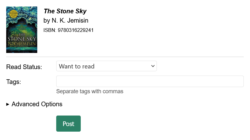
Screenshot 1: The default form is much more minimal
Next I updated the Published field. Previously, the field was always displayed and had an instruction to leave it blank if you wanted to publish the post right away. A better UX is if the default says “Now” and the datetime field only appears if you choose to change it.
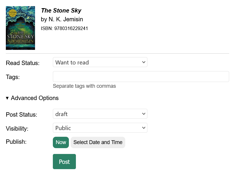
Screenshot 2: Advanced Options expanded with the default Publish set to “Now”
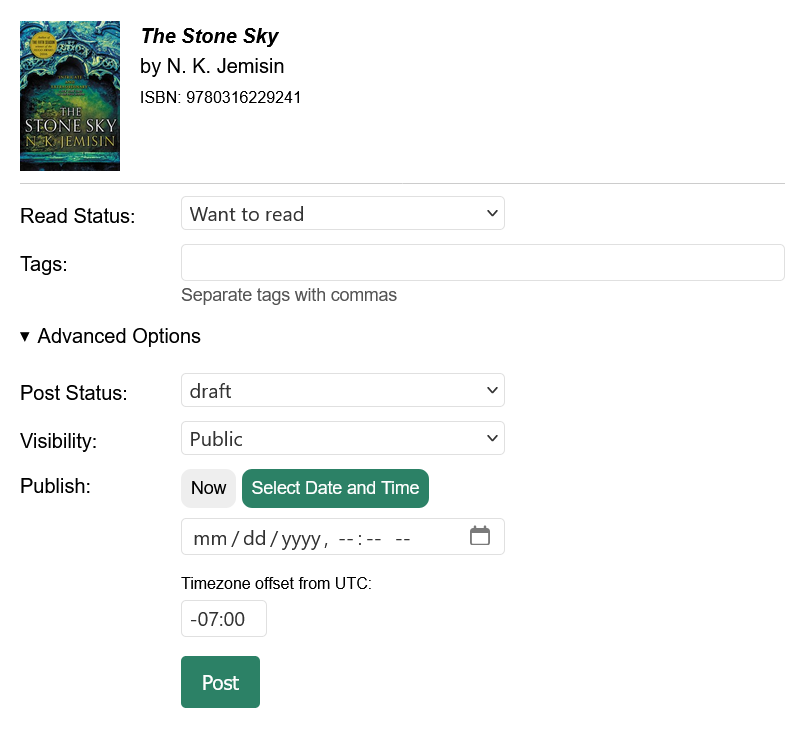
Screenshot 3: Advanced Options expanded and the “Select Date and Time” option selected
The next thing I am working on is lining up the left side of the title/author/ISBN text with the form inputs below them.
I am quite pleased with how this is turning out. Let me know what you think!